Creating a responsive user interface that adapts seamlessly to various screen resolutions and aspect ratios is a common challenge in game development. With the wide array of devices available today, from smartphones to tablets and desktop monitors, it's crucial to implement a UI strategy that ensures a consistent and visually appealing experience across all platforms.
In this article, we'll explore different approaches to handling UI layouts in Unity that we use in our productions at Lonestone Studio, focusing on Canvas strategies that can help you create flexible and scalable interfaces for your games.
Understanding Screen Spaces
Before diving into specific strategies, it's important to understand the different screen spaces available in Unity for UI elements. While there are multiple options, we'll focus on the most commonly used for HUDs and menus:
- Screen Space - Overlay: UI elements are rendered on top of the scene, directly on the screen. This is the most common choice for HUDs and menus.
- Screen Space - Camera: UI elements are rendered from a specific camera's point of view. While this can be useful for certain effects like using perspective to tilt UI or camera post effects, it's generally more complex and less flexible than the Overlay mode.
Canvas Scaler Configurations
The Canvas Scaler component in Unity provides several scaling modes to handle different screen sizes. We'll focus on two main options:
- Scale With Screen Size: This mode scales the entire Canvas based on a reference resolution. It's versatile and works well for most games.
- Constant Physical Size: This mode attempts to maintain a consistent physical size regardless of screen resolution. It can be useful for certain types of games but may not be ideal for all situations.
For most games, the "Scale With Screen Size" option provides the best balance of flexibility and control:
- better maintained overall layout and aesthetic across different devices
- handle a wider range of screen sizes and aspect ratios, from mobile phones to tablets and desktop monitors
- generally requires less real-time calculation
However, "Constant Physical Size" can be superior in specific scenarios, such as:
- Games with critical text readability requirements
- UIs that prioritize consistent touch target sizes for accessibility
- Applications where maintaining exact physical measurements is crucial (e.g., certain educational or professional tools)
In the 2 following strategies, I'll go with the default "Scale With Screen Size" since it will overall preserve layouts better. Let's see how!
Strategy 1: Fixed Layout with Expand Option
This strategy involves creating a fixed layout designed for a specific aspect ratio, then using the "Expand" option to fill the screen surrounding space on different aspect ratio.
With this strategy, design is greatly simplify since core UI elements doesn't need to be responsive: the main content is centered with a constant ratio.
This is the strategy to use if you want your design team to love you: it enables working with a single consistent reference resolution and require few to no responsive implementation.
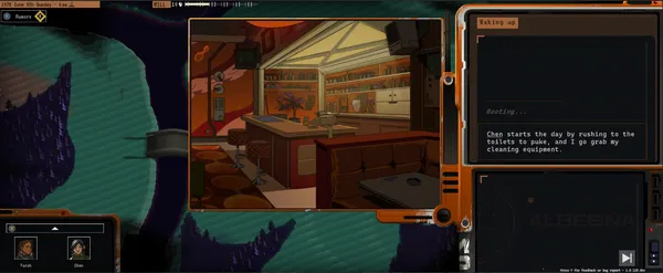
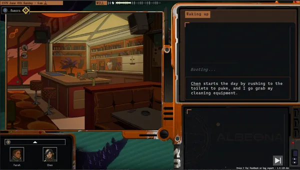
Example:
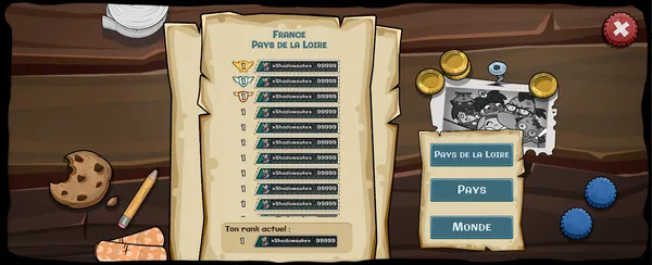
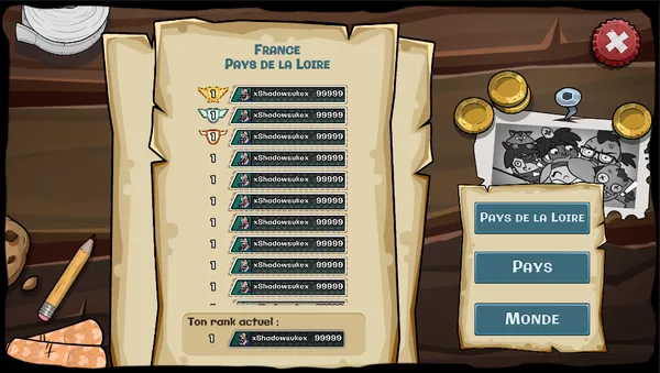
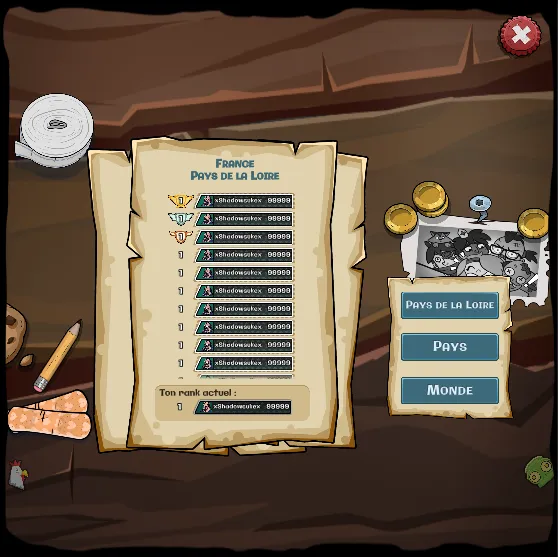
Here is some captures taken from our previous title City Invaders that illustrate the result. We choose to simply stretch the background because deformations are ok with this illustration. Another option is to use a tilling background or a centered and large enough illustration.
Implementation:
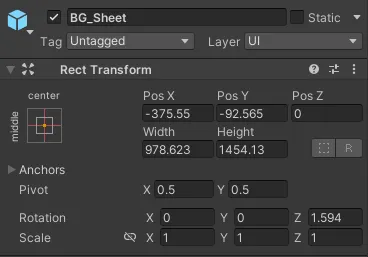
- Set the Canvas to "Screen Space - Overlay".
- Set the Canvas Scaler to "Scale With Screen Size" mode.
- Choose a reference resolution that matches your target aspect ratio (e.g., 1920x1080 for 16:9).
- Set the "Screen Match Mode" to "Expand".
- Setup the background to stretch (and no background if you have a game world to display)
- Setup the content anchored from the center, within the reference resolution limits.
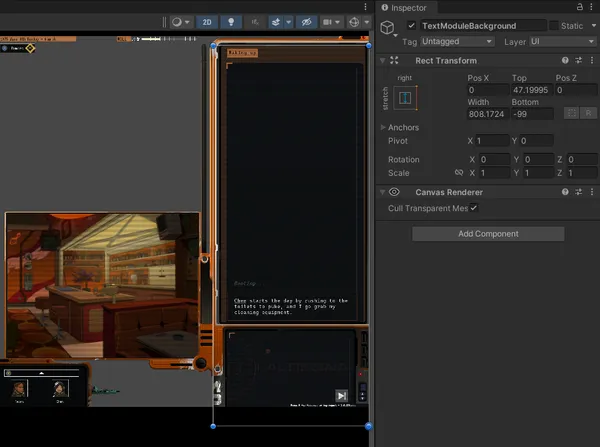
Strategy 2: Fluid Layout with Expand Option
This is the same as before BUT the layout is not fixed in the middle and is fluid from screen borders anchors. The expand option here is only to ensure the width is never less than the reference resolution width, and height is never less the reference resolution height. In short: that the content boundaries are fully visible within the screen.
Example:
Here is some captures taken from our current title Neoproxima that illustrate the result. No UI background here, the game world from main camera is the background.
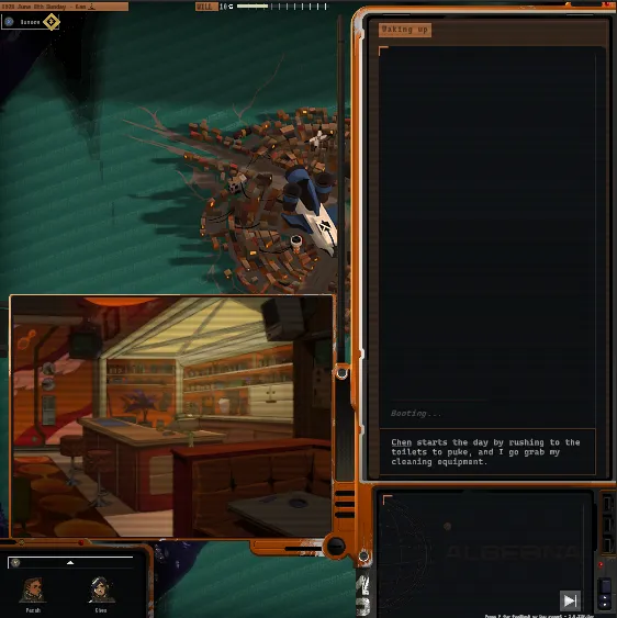
Squared ratio. Not elegant, but at least it doesn't break and vertical space is used to display more text.
Implementation:
- Set the Canvas to "Screen Space - Overlay".
- Set the Canvas Scaler to "Scale With Screen Size" mode.
- Choose a reference resolution that matches your target aspect ratio
- Set the "Screen Match Mode" to "Expand".
- Setup the content to stretch: you have the guarantee from the expand mode that the width and the height will be at least the reference resolution.
Advantages of the expand approach
- Maintains a consistent layout across devices
- Works well for menu screens and UIs with specific designs
- Easier to implement complex layouts
Limitations
- May result in letterboxing on certain aspect ratios
- Button positioning might not be optimal for touch input on all devices
- Can lead to elements being too small on aspects ratios too different from the reference reslution ratio
Conclusion
Implementing an effective UI canvas strategy is crucial for creating games that look great and function well across a variety of devices and screen sizes. The "Expand" approach, whether used with a fixed or fluid layout, offers a robust solution for many game projects.
The fixed layout with expand option provides simplicity in design and implementation, making it ideal for projects where maintaining a consistent core layout is important. On the other hand, the fluid layout with expand option offers more flexibility and better utilization of screen real estate, albeit with increased complexity in design and implementation.
That's it, if you liked the writing, don't forget to follow me on your favorite network for more game development insights and Unity tips!